B2B2C
Breathing AI
Heuristic Evaluation
Here, I carried out a Heuristic Evaluation using the ’10 Usability Heuristics for User Interface Design’ by Jakob Nielsen.
Back to Project
Heuristics
Violation
Recommendation
Severity
Consistency and standards
Toast spacing is differ from websites


All toast need to be consistent, and we need apply responsive design for the module itself.
2
User support
The extension wont stay at my extension bar, so I need to restart it and finish onboarding flow each time

Allow the user to keep their place in the extension during onboarding even if they leave during onboarding
4
Simplicity, Language
I am confused the language “break” in many places: Take a break or Break reminder. Base on my experience in using other relax apps, take a break from work means drink water, stand up, close your eyes but not do exercise.
Better or simpler language? like “take a break and do a 5 mins exercise” or “start 1 mins exercise”
2
Simplicity, Language
Break is a simple understandable text, if we need paragraph to explain it, is prove we need a better word? :)

Same as above one
2
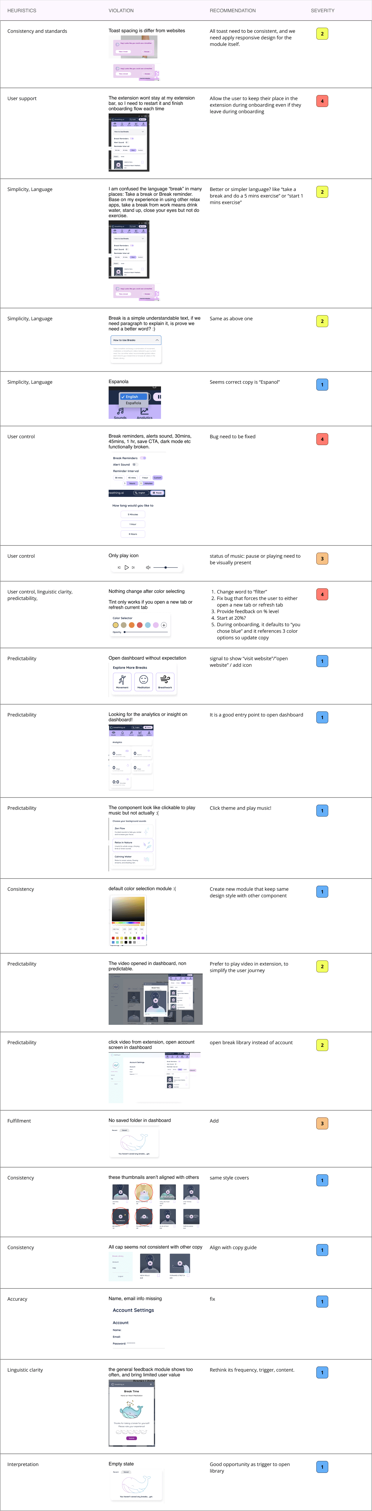
Simplicity, Language
Espanola
Seems correct copy is “Espanol”
1
User control
Break reminders, alerts sound, 30mins, 45mins, 1 hr, save CTA, dark mode etc functionally broken.


Bug need to be fixed
4
User control
Only play icon

status of music: pause or playing need to be visually present
3
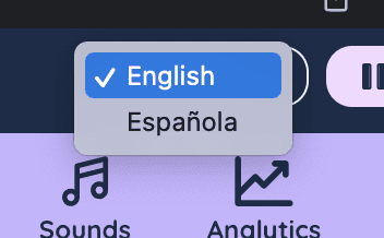
User control, linguistic clarity, predictability,
Nothing change after color selecting
Tint only works if you open a new tab or refresh current tab
Change word to “filter”
Fix bug that forces the user to either open a new tab or refresh tab
Provide feedback on % level
Start at 20%?
During onboarding, it defaults to “you chose blue” and it references 3 color options so update copy
4
Predictability
Open dashboard without expectation

signal to show “visit website”/”open website” / add icon
1
Predictability
Looking for the analytics or insight on dashboard!

It is a good entry point to open dashboard
1
Predictability
The component look like clickable to play music but not actually :(

Click theme and play music!
1
Consistency
default color selection module :(

Create new module that keep same design style with other component
1
Predictability
The video opened in dashboard, non predictable.

Prefer to play video in extension, to simplify the user journey
2
Predictability
click video from extension, open account screen in dashboard

open break library instead of account
2
Fulfillment
No saved folder in dashboard

Add
3
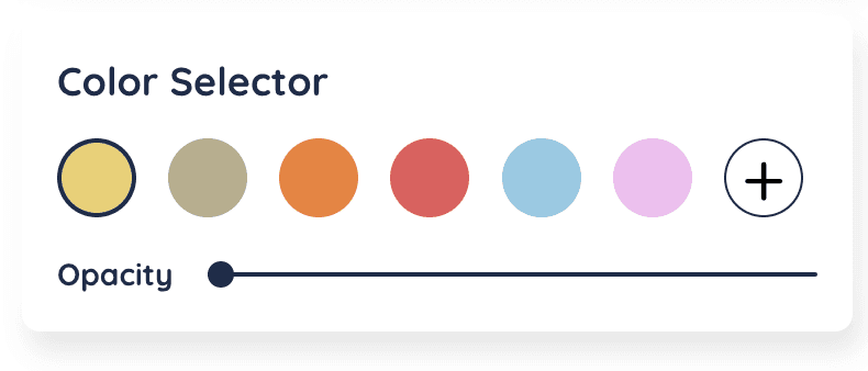
Consistency
these thumbnails aren’t aligned with others
same style covers
1
Consistency
All cap seems not consistent with other copy

Align with copy guide
1
Accuracy
Name, email info missing

fix
1
Linguistic clarity
the general feedback module shows too often, and bring limited user value

Rethink its frequency, trigger, content.
1
Interpretation
Empty state

Good opportunity as trigger to open library
1